Detailed Functionality
The functionality of the Dashboard is divided into two main components: data collection and data visualization. You can find detailed information about both components below.
1. Data Collection
The amount of data collected by the Dashboard varies for each endpoint of the monitored Flask application, depending on the monitoring level selected. To select the monitoring level of your endpoints, you have to do the following (assuming you have successfully configured the Dashboard as described in the configuration page):
Log into the Dashboard at: http://localhost:5000/dashboard/login
Go to the Overview tab in the left menu: http://localhost:5000/dashboard/overview
Select the endpoints that you want to monitor.
Select the desired monitoring level.
A summary of the monitoring levels is provided next. Note that every level keeps all the features of the level below, in addition to bringing its own new features, as represented in the diagram below.
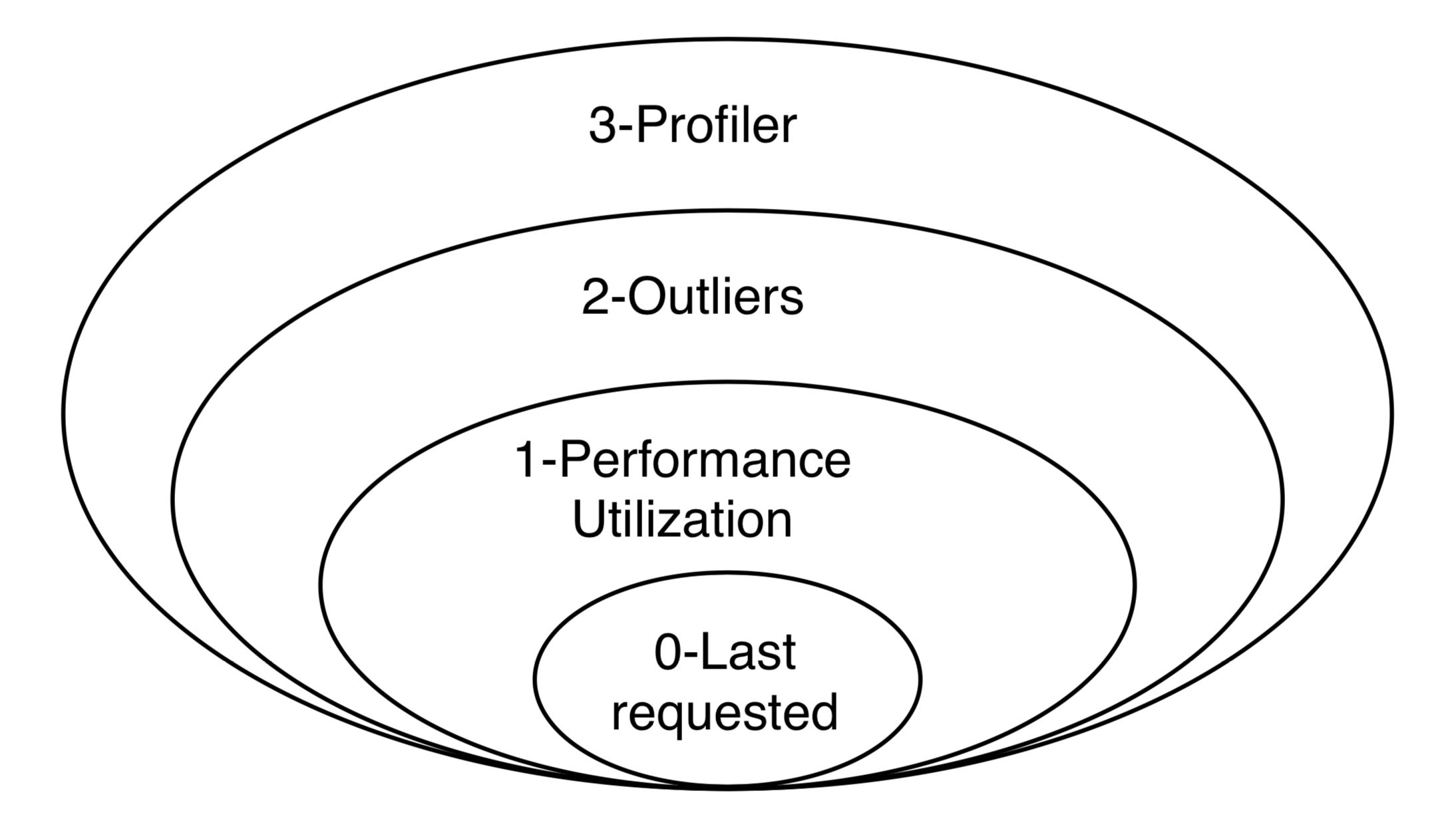
Monitoring Level 0 - Disabled
When the monitoring level is set to 0, the Dashboard does not monitor anything about the performance of the endpoint. The only data that is stored is when the endpoint is last requested.
Monitoring Level 1 - Performance and Utilization Monitoring
When the monitoring level is set to 1, the Dashboard collects performance (as in response time) and utilization information for every request coming to that endpoint. The following data is recorded:
Duration: the duration of processing that request.
Time_requested: the timestamp of when the request is being made.
Version_requested: the version of the Flask-application at the moment when the request arrived. This can either be retrieved via the VERSION value, or via the GIT value. If both are configured, the GIT value is used.
group_by: An option to group the collected results. As most Flask applications have some kind of user management, this variable can be used to track the performance between different users. It is configured using the following command:
def get_user_id():
    return 1234  # replace with a function to retrieve the id of the
                   # user within a request.

dashboard.config.group_by = get_user_id
# Note that the function itself is passed, not the result of the function.
Thus, it becomes:
from flask import Flask
import flask_monitoringdashboard as dashboard

app = Flask(__name__)
dashboard.config.init_from(file='/<path to file>/config.cfg')

def get_user_id():
    return '1234'  # replace with a function to retrieve the id of the
                   # user within a request.

dashboard.config.group_by = get_user_id
dashboard.bind(app)

@app.route('/')
def index():
    return 'Hello World!'

if __name__ == '__main__':
    app.run(debug=True)
The group_by-function must be a function that either returns a primitive (bool, bytes, float, int, str), or a function, or a tuple/list. Below is a list with a few valid examples:
Code
Result
dashboard.config.group_by = lambda: 3
3
dashboard.config.group_by = lambda: (‘User’, 3)
(User,3)
dashboard.config.group_by = lambda: lambda: 3
3
dashboard.config.group_by = (‘User’, lambda: 3)
(User,3)
dashboard.config.group_by = lambda: ‘username’
username
dashboard.config.group_by = lambda: [‘Username’, ‘username’]
(Username,username)
dashboard.config.group_by = lambda: [(‘User’, lambda: 3), (‘Username’, lambda: ‘username’)]
((User,3),(Username,username))
IP: The IP-address from which the request is made. The IP is retrieved by the following code:
from flask import request
print(request.environ['REMOTE_ADDR'])
Monitoring Level 2 - Outliers
When the monitoring level is set to 2, the Dashboard collects extra information about slow requests.
It is useful to investigate why certain requests take way longer to process than other requests. If this is the case, a request is seen as an outlier. Mathematically, a request is considered an outlier if its execution is a certain number of times longer than the average duration for requests coming to the same endpoint:
\(duration_outlier > duration_average * constant\)
Where \(duration_average\) is the average execution time per endpoint, and \(constant\) is given in the configuration by OUTLIER_DETECTION_CONSTANT (its default value is \(2.5\)).
When a request is an outlier, the Dashboard stores more information about it, such as:
The stack-trace in which it got stuck.
The percentage of the CPU’s that are in use.
The current amount of memory that is used.
Request values.
Request headers.
Request environment.
The data that is collected from outliers, can be seen by the following procedure:
Go to the Dashboard Overview: http://localhost:5000/measurements/overview
Click the endpoint for which you want to see the Outlier information.
Go to the Outliers tab: http://localhost:5000/dashboard/endpoint/:endpoint_id:/outliers
Monitoring Level 3 - Profiler
When the monitoring level is set to 3, the Dashboard performs a statistical profiling of all the requests coming to that endpoint. What this means is that another thread will be launched in parallel with the one processing the request, it will periodically sample the processing thread, and will analyze its current stack trace. Using this information, the Dashboard will infer how long every function call inside the endpoint code takes to execute.
The profiler is one of the most powerful features of the Dashboard, pointing to where your optimization efforts should be directed, one level of abstraction lower than the performance monitoring of Level 1. To access this information, you have to:
Go to the Overview tab in the left menu: http://localhost:5000/dashboard/overview
Select an endpoint for which the monitoring level is or was at some point at least 2.
Go to the Profiler tab: http://localhost:5000/dashboard/endpoint/:endpoint_id:/profiler
Go to the Grouped Profiler tab: http://localhost:5000/dashboard/endpoint/:endpoint_id:/grouped-profiler
The Profiler tab shows all individual profiled requests of an endpoint in the form of a execution tree. Each code line is displayed along with its execution time and its share of the total execution time of the request.
The Grouped Profiler tab shows the merged execution of up to 100 most recent profiled requests of an endpoint. This is displayed both as a table and as a Sunburst graph. The table shows for each code line information about the Hits (i.e. how many times it has been executed), average execution time and standard deviation, and also total execution time.
2. Exception Monitoring
Flask-MonitoringDashboard provides comprehensive exception monitoring to help you track and debug errors in your application. Exception monitoring is automatically enabled for all endpoints with monitoring level 1 or above.
All unhandled exceptions are automatically captured with:
Full stack traces showing the exact line where the error occurred
Exception type and message
Request context (endpoint, method, parameters)
Timestamp and occurrence count
Function code context with syntax highlighting
The captured exceptions are grouped by their stack trace signature, making it easy to identify recurring issues.
You can also manually capture exceptions for better debugging:
from flask_monitoringdashboard import capture_exception

try:
    # Your code that might raise an exception
    result = risky_operation()
except ValueError as e:
    capture_exception(e)  # Manually capture with stack trace
    # Handle the error gracefully
    return "An error occurred", 400
This is useful when you want to track handled exceptions or add additional context to error reporting.
To view captured exceptions:
Application-wide view: Go to http://localhost:5000/dashboard/exceptions
This shows all exceptions across all endpoints, with:
Exception count by type
Most recent occurrences
Affected endpoints
Filtering by exception type, endpoint, or time period
Endpoint-specific view: Click on any endpoint in the Overview, then navigate to the Exceptions tab: http://localhost:5000/dashboard/endpoint/:endpoint_id:/exceptions
This shows exceptions specific to that endpoint with:
Stack trace visualization with syntax-highlighted code
Line numbers and function names
Ability to expand/collapse stack frames
Full file paths on hover
Exception data is automatically cleaned up as part of the database pruning schedule (see section 5 below). When you run database pruning, old exception occurrences are removed along with orphaned exception types and messages.
3. Data Visualization
The Dashboard shows the collected data by means of two levels of abstraction: application-wide and endpoint-specific.
Application
Visualizations showing aggregated data of all the endpoints (with monitoring level at least 1) in the application can be found under the Dashboard menu:
Overview: A table with the all the endpoints that are being monitored (or have been monitored in the past). This table provides information about when the endpoint was last requested, how often it is requested and what is the current monitoring level. Each endpoint can be clicked to access the Endpoint-specific visualizations.
Hourly API Utilization: This graph provides information for each hour of the day of how often the endpoint is being requested. In this graph it is possible to detect popular hours during the day.
Multi Version API Utilization: This graph provides information about the distribution of the utilization of the requests per version. That is, how often (in percentages) is a certain endpoint requested in a certain version.
Daily API Utilization: This graph provides a row of information per day. In this graph, you can find whether the total number of requests grows over days.
API Performance: This graph provides a row of information per endpoint. In that row, you can find all the requests for that endpoint. This provides information whether certain endpoints perform better (in terms of execution time) than other endpoints.
Reporting: A more experimental feature which aims to automatically detect and report changes in performance for various intervals (e.g. today vs. yesterday, this week vs. last week, etc).
Endpoint
For each endpoint in the Overview page, you can click on the endpoint to get more details. This provides the following information (all information below is specific for a single endpoint):
Hourly API Utilization: The same hourly load as explained in (2) above, but this time it is focused on the data of that particular endpoint only.
User-Focused Multi-Version Performance: A circle plot with the average execution time per user per version. Thus, this graph consists of 3 dimensions (execution time, users, versions). A larger circle represents a higher execution time.
IP-Focused Multi-Version Performance: The same type of plot as ‘User-Focused Multi-Version Performance’, but now that users are replaced by IP-addresses.
Per-Version Performance: A horizontal box plot with the execution times for a specific version. This graph is equivalent to (4.), but now it is focused on the data of that particular endpoint only.
Per-User Performance: A horizontal box plot with the execution time per user. In this graph, it is possible to detect if there is a difference in the execution time between users.
Profiler: A tree with the execution path for all requests.
Grouped Profiler: A tree with the combined execution paths for all (<100) requests of this endpoint.
Outliers: The extra information collected on outlier requests.
4. Make it your own!
Just as no two applications are the same, we understand that monitoring requirements differ for every use case. While all the above visualizations are included by default in the FMD and answer a wide range of questions posed by the typical web application developer, you can also create your own custom visualizations tailored to your needs.
You might wish to know how the number of unique users, the size of your database, or the total number of endpoints have evolved over time. This is now easy to visualize using FMD.
An example of a custom graph is shown below. FMD will execute on_the_minute()
every minute at the second 01 and the graph will appear in the Custom graphs menu.
def on_the_minute():
    print(f"On the minute: {datetime.datetime.now()}")
    return int(random() * 100 // 10)


minute_schedule = {'second': 00}

dashboard.add_graph("On Half Minute", on_the_minute, "cron", **minute_schedule)
Note the “cron” argument to the add graph. Just like in the case of the unix cron utility you can use more complex schedules. For example, if you want to collect the data every day at midnight you would use:
midnight_schedule = {'month':"*",
                     'day': "*",
                     'hour': 23,
                     'minute': 59,
                     'second': 00}
Besides cron, there’s also the “interval” schedule type, which is exemplified in the following snippet:
def every_ten_seconds():
    print(f"every_ten_seconds!!! {datetime.datetime.now()}")
    return int(random() * 100 // 10)


every_ten_seconds_schedule = {'seconds': 10}

dashboard.add_graph("Every 10 Seconds", every_ten_seconds, "interval", **every_ten_seconds_schedule)
Note that not all fields in the schedule dictionary
are required, only the non-zero / non-star ones.
Also, note that in the “cron” graph types you use singular names (e.g. second) while in the “interval” you use plurals (e.g. seconds).
Finally, the implementation of the scheduler in the FMD is based on the appscheduler.schedulers.Background schedulers about which you can read more in the corresponding documentation page.
5. Adding database cleaning schedule
As your application grows, so will the amount of data stored in the database. To prevent it from growing too large, you can set up a schedule to clean the database. Pruning is fully customizable, and can be set up to run as often as you want deleting data as old as you want through your own cron schedule.
This can be done by adding the following code to your application:
weeks_to_keep = 8
delete_custom_graph_data = True
pruning_cron_schedule = {'month':"*/2",
                        'day': 1,
                        'hour': 3,
                        'minute': 0,
                        'second': 0}

dashboard.add_database_pruning_schedule(weeks_to_keep, delete_custom_graph_data, **pruning_cron_schedule)
The first argument is how many weeks of data you want to keep - in this case we delete data older than the last two months. Second argument indicates whether you want to delete custom graph data as well. The third argument is the cron schedule, which in the presented case will clean the database every 2 months, on the first day of the month at 3:00 AM.
That’s it! Now you won’t have to worry about the performance slowing down with time.
6. Telemetry
The Dashboard is setup to be able to collect telemetric-data. This data-collection can be toggled on and off under the “Configuration” route.
The collected data is released weekly at https://flask-dashboard.github.io/fmd-telemetry.
You can find detailed information about what and how data is collected below.
What:
Number of endpoints: The amount of endpoints, no names or anything that could expose your application.
Number of blueprints: The amount of blueprints, again - only the number.
Aggregated monitoring levels: To determine the most frequently utilized monitoring level, we aggregate the levels set from each endpoint.
Version number: In order to determine how often people update their dashboards, we collect the build number.
Route visits: Which routes you use in the dashboard.
Python version: To know what versions of python are actively being used.
How:
Anonymized data is sent to a remote server. This way we can monitor which functionalities are being used the most, and which functionalities are not being used at all. We are a small research team and this way we can focus our efforts on what actually matters. This is most of the logic behind the telemetry:
def post_to_back_if_telemetry_enabled(class_name='Endpoints', **kwargs):
  """
  Function to send data to server, with dynamic IP fetching.
  If the IP cannot be fetched, the function will silently exit without sending data.
  """
  if telemetry_config.telemetry_consent or class_name == 'FollowUp':
     github_file_url = 'https://raw.githubusercontent.com/flask-dashboard/fmd-telemetry/master/ip_address'
     parse_server_ip = fetch_ip_from_github(github_file_url)
     if parse_server_ip is None:
           return  # Exit silently if no IP is fetched


     parse_server_endpoint = f'http://{parse_server_ip}/parse/classes/{class_name}'
     headers = telemetry_config.telemetry_headers
     data = {'fmd_id': telemetry_config.fmd_user, 'session': telemetry_config.telemetry_session}
     for key, value in kwargs.items():
           data[key] = value

     try:
           response = requests.post(parse_server_endpoint, json=data, headers=headers, timeout=1)
           return response
     except requests.exceptions.ConnectionError as e:
           return None
Need more information?
Check out the contact page to see how you can get in touch with us.
